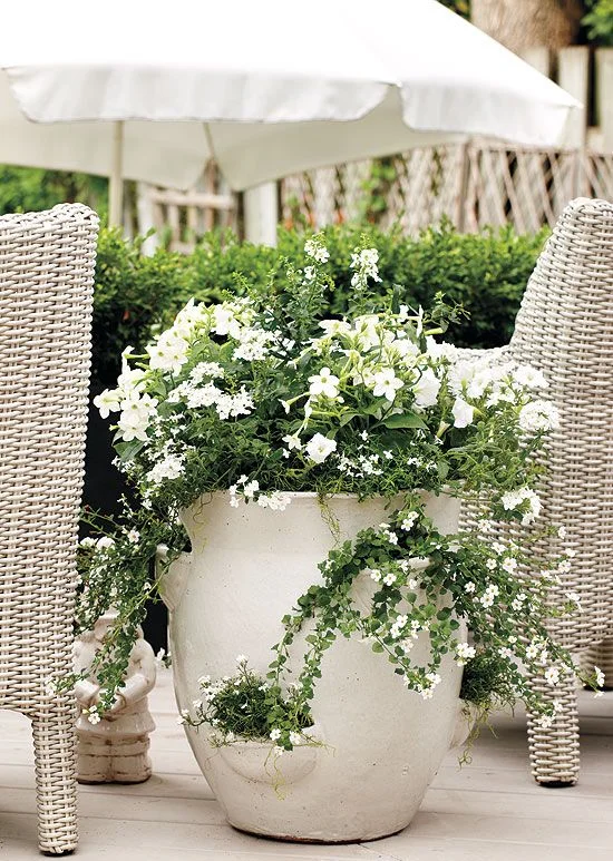
im a big believer in "less is more"....and a simple palette like black and white gives you some much more than just black and white....a little bit of great design has a little something to do with it! neutral backdrops are so complimentary to their surroundings... see what i mean?
opaldc.com
georgianadesign.tumblr.com
southernliving.com
canadiangardening.com
inspiredhomedesign@squarespace.com
pageduke.com


